- Misspelling words and using poor grammar
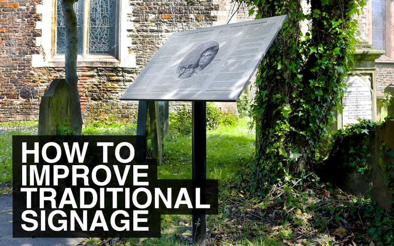
- Overly text heavy signs are a huge turn off
- Small font types that are hard to read
- Text not standing out from the background colour/image
- Dull or mismatched colour schemes
- Poor quality / pixelated images
- Poor quality materials that degrade over time or are easily vandalised
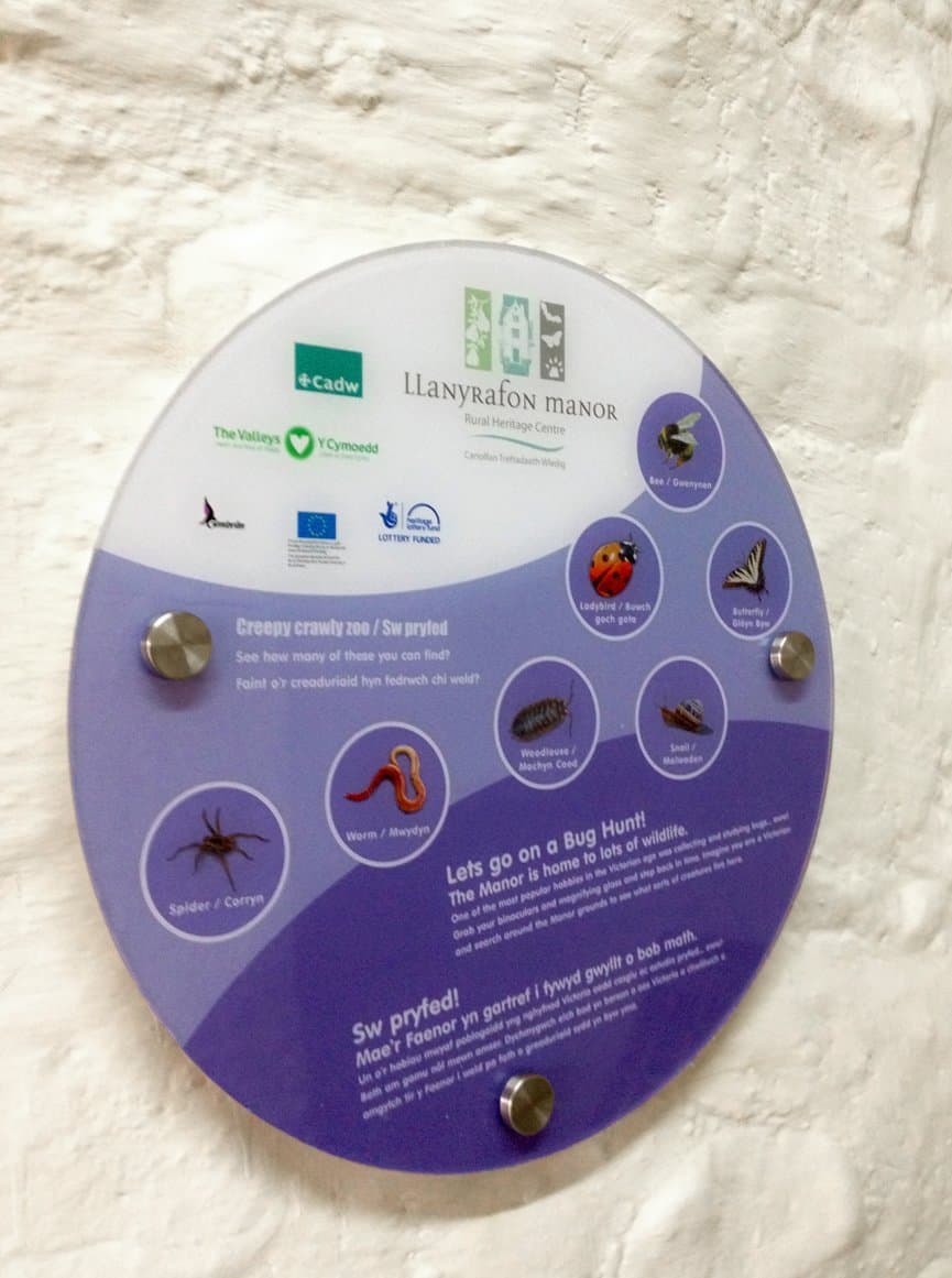
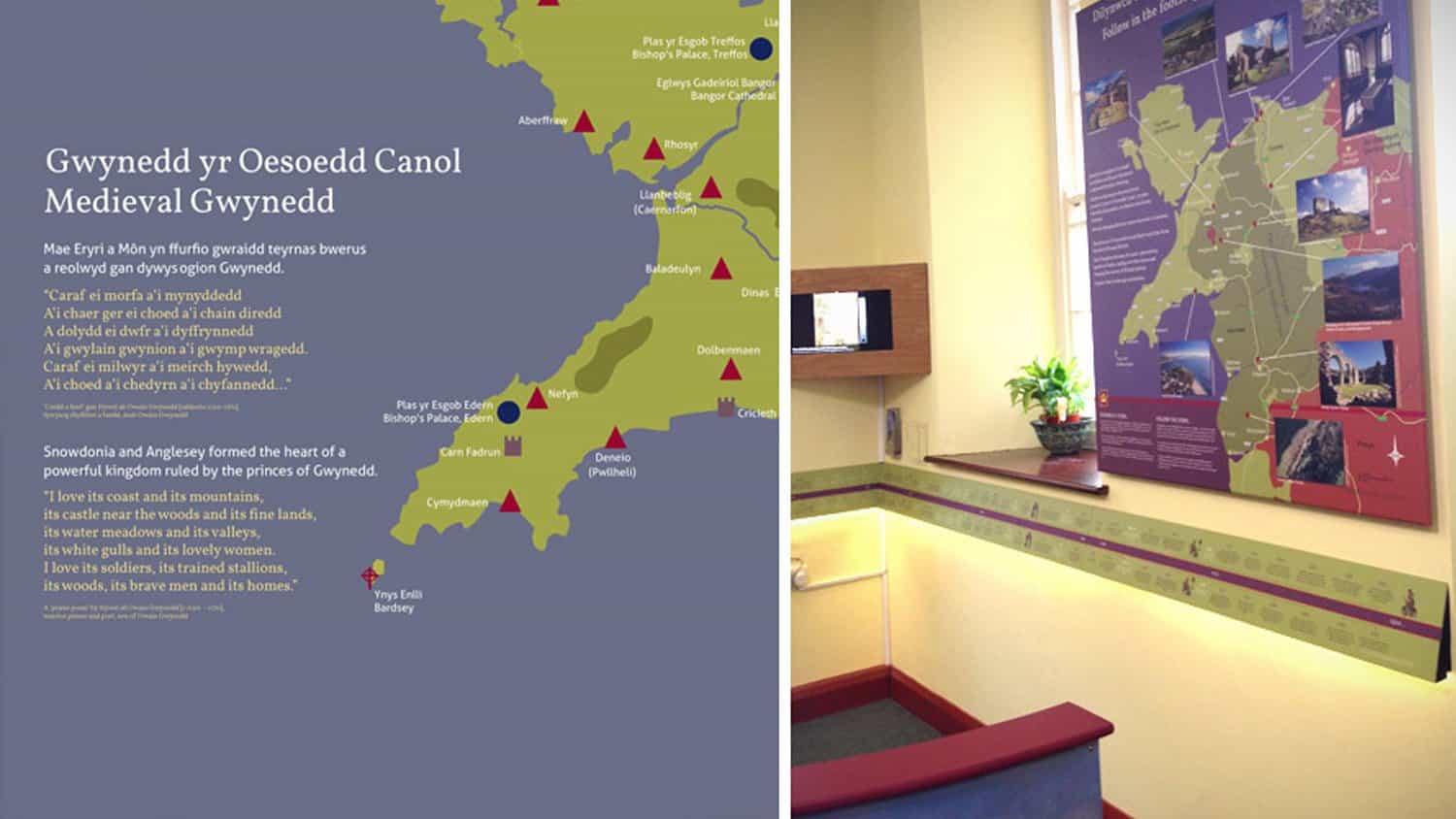
Each of the above are quite easy to fix with just a little bit of thought – don’t write too much text, consider the dwell time and how long somebody is likely to stand and read your sign. What information are you trying to share and what is the quickest way to convey this? Choose colours which go well together but also grab attention, and most of all construct your signage from long lasting materials.
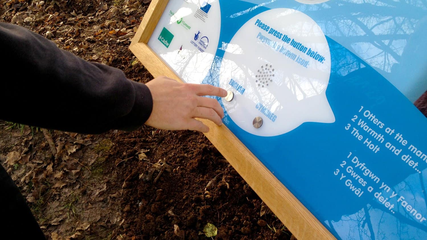
On top of all that there’s the fact that the digital age is most definitely upon us and with attention spans waning you have to work even harder to ensure your traditional signage remains appealing. Thankfully we here at Blackbox-av understand how to keep traditional signage alive and exciting.


Those were just a few of our tips, we hope that you found them useful! Do you have any more to add? Leave us a comment or send us a tweet! If you want to know more about our signage services, you can view more examples of our work, and you can get in touch with us with any questions.


