Wheelchair Accessible Interactive Interpretation
Rules to follow to ensure accessible interactives for wheelchair usersWheelchair Accessibility & Interpretation
The phrase ‘DDA compliance’ refers to The Disability Discrimination Act of 2005, which has since been superseded by the Equalities Act of 2010 (although most people still refer to ‘DDA’ when discussing accessibility). The end goal is the same however, to ensure reasonable levels of access for disabled people within various establishments. This is particularly important when it comes to heritage and visitor attractions.
Accessible design covers a range of things such as visual, hearing or physical impairment and is vital when creating an engaging exhibition space, especially when interacting with interpretation. In this article we’ll focus on physical impairment and more specifically persons in a wheelchair.
As suppliers of touchscreens, kiosks, tables and other hardware, as well as designers of bespoke interpretive solutions, we have to deeply consider the access implications of the items we supply. In this article we’ll look at the rules we follow to ensure everything we supply is accessible with the key being to keep things within reach.
The main source of this information is The Smithsonian Guidelines for Accessible Exhibition Design as well as our own experience. Note: Images are not to scale.
Wall Reach
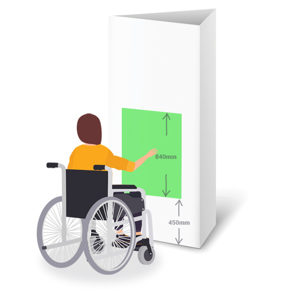
These guidelines relate to the reachable space for a wall mounted exhibit or interactive. Here you have to understand how close to the wall a person can get while seated in a wheelchair with the primary consideration being the height of the exhibit.
It’s therefore necessary to keep anything for interaction within this more easily reached zone. This applies to triggers such as buttons, headphones or what is often overlooked, the user interface items of software, such as navigation buttons.
The average wheelchair seat is around 485mm high, so we recommend the reach zone starts 450mm off the ground and is then around 840mm high.
Table Reach
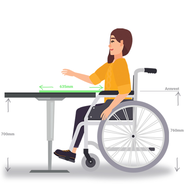
This is often referred to as ‘maximum forward reach over an obstruction’ but is also a good benchmark for accessible space on a table, this can be a table that includes items for investigation, buttons to trigger content or again software on a touchtable.
The maximum reach zone here is equal to around 635mm. This is assuming a person can fit their wheelchair fully underneath the table in question up to their chest. If unable to do so then the reach zone will be reduced by the amount of empty space between the user and the table.
An adult sized wheelchair is around 485mm high to the chair, when you take into account a persons lap height this rises to around 685mm. The average wheelchair is around 600-700mm long from footrest to the wheels.
Therefore a table interactive should have an allowance of at least 700mm height and around 700mm depth if you intend a user to fit to the tables edge, with a reach zone equalling around 635mm.
Angled Reach
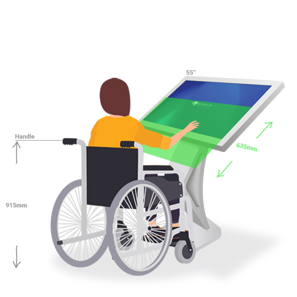
We usually use these guidelines when referring to free standing touchscreen kiosks but they can also apply to other builds and interactives. Smaller format displays (22″ or so) are usually quite accessible with every part of the screen easily reachable as long as the kiosk design allows a wheelchair to get close enough. You do need to consider the lower angle of viewing for a person in a wheelchair so be wary of things such as screen glare.
Issues can arise with larger format displays, such as 43″ or 55″ and up. Unless you’re using a specially designed kiosk the likelihood is wheelchair users will only be able to get as close as the front of the wheelchair allows. This then restricts access to the top section of the touchscreens. The average person can reach around 635mm from their body easily while seated.
Reach beyond this is obviously possible especially with movement of the body (leaning or stretching) but it’s best to design interactives with 635mm reach in mind.
For use with software this means accounting for things such as user interface items being located at the bottom of the screen (something our museum software package Lightbox3 allows).
Hopefully the above has been helpful, these are the rough guidelines we follow when designing something with wheelchair access in mind. There are however a wide range of wheelchair sizes, various types of impairment and various use case scenarios so we recommend you always do your own testing when developing your interpretive solutions for the maximum ease of use.
We take accessibility very seriously when developing our interpretive offerings, you can see some of the products we offer with this in mind below.
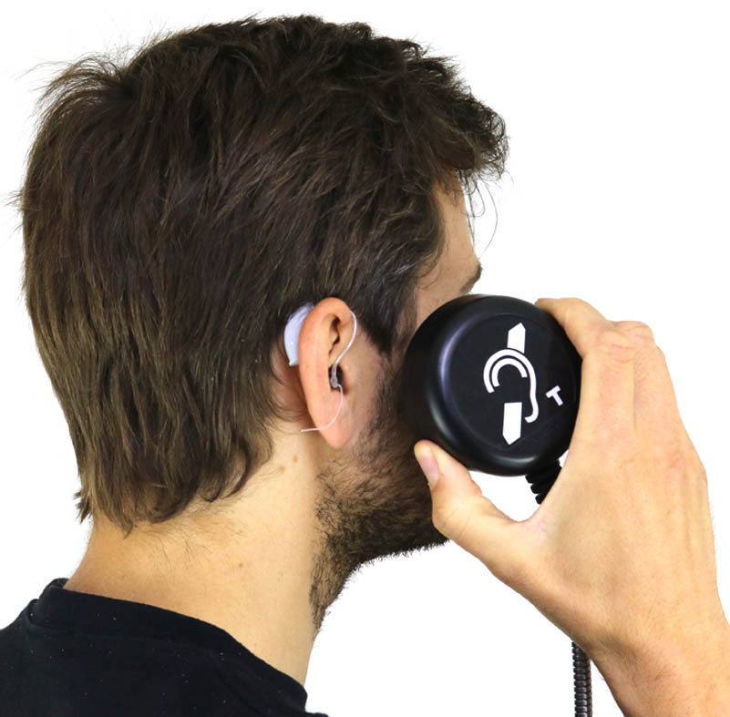
The Hearing Loop version of our Heavy Duty Handset offers the same high quality audio as the standard HDH, but the included T-Coil technology makes it compatible with hearing aids. Available as a standard handset or with AutoPlay functionality this allows the unit to trigger content simply by picking it up. Something that makes it even easier to use.
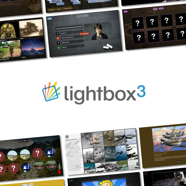
Lightbox 3 is our off-the-shelf software package, with this powerful system you’re able to create exciting touchscreen exhibits from your own audio and visual content. Lightbox is very flexible, the default font is design to be as readable as possible, you’re able to set font sizes as large as required and use custom fonts if needed. It also allows the navigation UI to be aligned to the bottom of the screen within easy reach of all users.
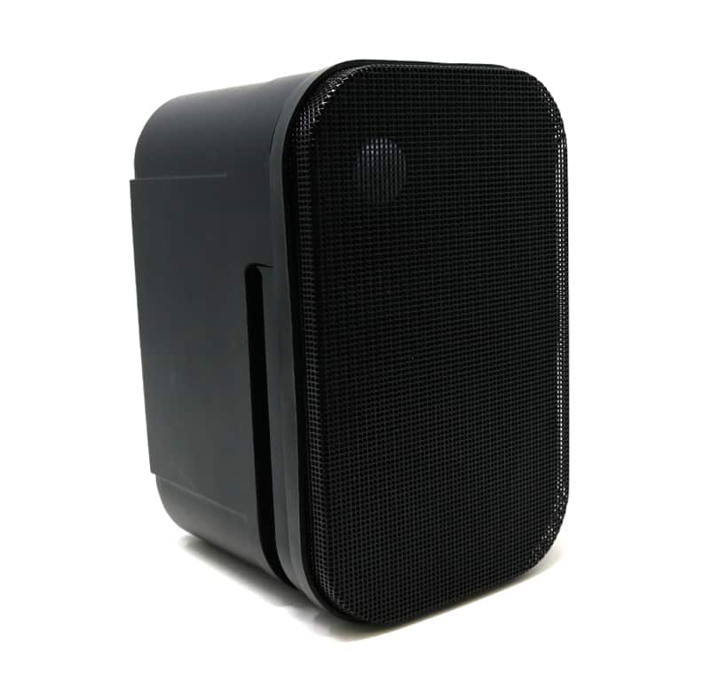
The Message in a Speaker PLUS could not be easier to use. Audio is activated when a user moves within its PIR range. All the electronics are built into the speaker and it is powered via one cable. This makes it simple to install, and even easier for visitors to use, no need to push or reach triggers simply move within range and listen to the audio.
Have any questions? Get in touch!
Sign up…
Sign up to our Newsletter below to receive news and exclusive insights.

